MoMA Poster & Card
Design A Poster & Informational Card
Sketches:
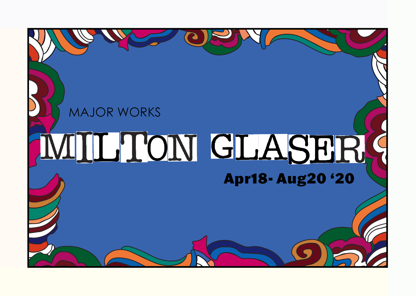
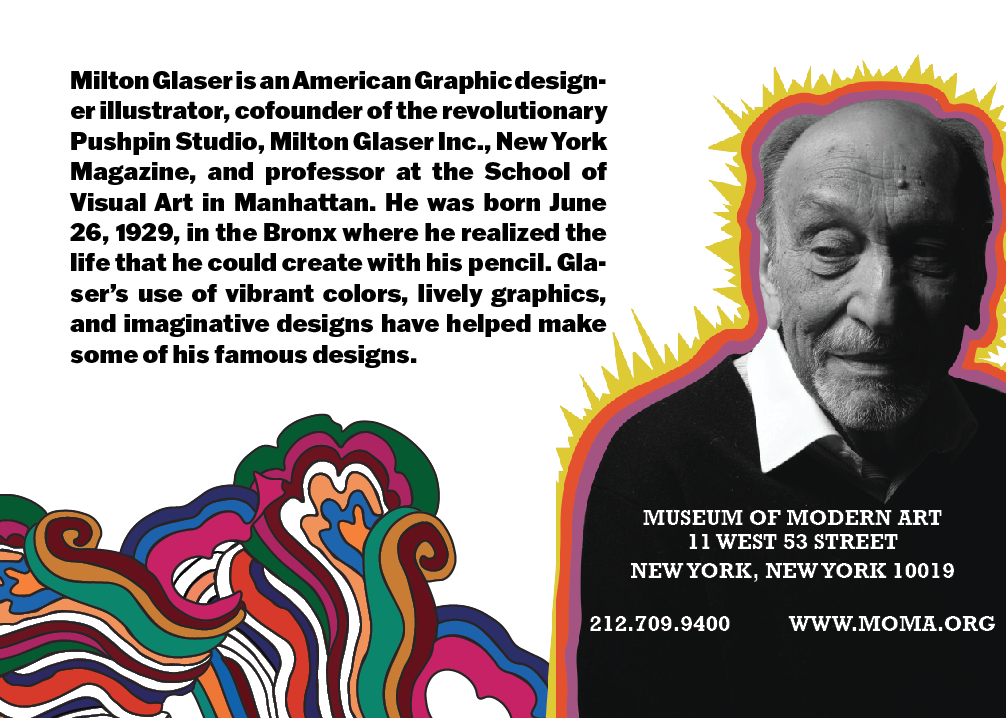
How can print materials promote and educate prospective exhibit attendees? To solve these problems I must create an informative and eye-catching museum poster and information card for the anticipated design series by the Modern Museum of Art featuring the major works of renowned artist Milton Glaser. The challenge was how to fit all MoMA’s necessary information and effectively communicate event details. All while developing a design that aligned with both Milton Glaser's and MoMA’s branding. I had to ensure there was still a cohesive look across both the museum poster and exhibit informational card. As well as create a unique visual display to engage and entice viewers to attend the exhibition.


Research, Ideation, Creation, and Critiques
Compositions:
Following the design process, five core stages are Empathize, Define, Ideate, Prototype, and Test. I was able to stay consistent in finding human-centered solutions:
Conducted business analysis on MoMA to discover their current branding and past promotional designs to properly represent the museum
Formed competitor analysis of standard layouts, texts, colors, and content hierarchy used in the poster/informational card designs.
Analyzed Milton Glaser’s artistic style to decipher which elements I would implement into my color and text studies
Created multiple sketches of how to strategically place images, text, and graphical elements to develop into digital compositions
Displayed my work for peer's and professional's constructive criticism and what design to focus on going forward


Using Art To Advertise
By using recognizable psychedelic elements from Glaser’s Bob Dylan's greatest hits album viewers can connect the artist to his work and therefore are more interested in attending the event. I strategically placed these elements around the text, so the designs are easily legible. I provided more representation of Glaser's past commissions by using his iconic “I Love NY” logo as the font for his name. Using black and white for all other features of my design allowed for a clean yet fun look. Putting key titles and details in heavier-weighted text highlighted important information. Implementing more white space and taking out cluttered borders, busy backgrounds, and heavy body copy made me realize less is more with this design. Switching my approach from showcasing Glasser’s major works to instead incorporating them in detail saved the messaging of my design.


Leaving A Legacy
This opportunity led me to experiment with new materials, knowledge, and programming. By admiring Milton Glaser’s work, I was able to raise the standards of my own which led me in:
Effectively combining the two different branding and artistic styles of MoMA and Milton Glaser
Learning to put printing trials earlier on in my process to catch mistakes such as text sizing, image overlap, raster quality, and overall visual display
Discovering the proper dimensions and setups for multiple printing materials
Recognizing the importance of prioritizing context layout before additional design elements
Expanding my written and visual communication literacy

