Camp Brochure


Redesign An Exciting Summer Camp Brochure
How can a print brochure design win over the hearts of potential campers? To demonstrate this unique summer experience key elements to revise include:
Establish proper brand direction for the camp which included color schemes, logo development, fonts, and imagery.
Providing strong conceptual and visual continuity throughout the covers and interior
Organize text into a headline, subhead, and body copy.
Decide on a design theme that’s fun and engaging.
Sketches:


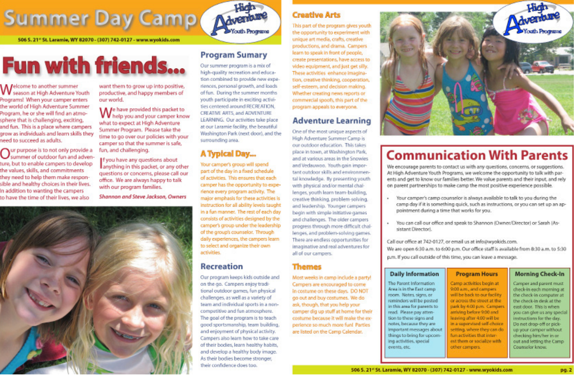
Original Brochure Design:


Research, Ideation, Creation, & Critiques
Conducting a business analysis allowed me to distinguish what the main goals of the program were, who they were trying to attract, and where, and when their season would take place. A competitor analysis was useful in identifying High Adventures’ strengths and weaknesses compared to the rest of the market. This research formed my artistic vision of implementing the client's Wyoming location with its nostalgic camping aspects. I was inspired by postcards, old Western movie posters, and simplified landscape graphics related to national parks. I curated various color palettes based on the earth tone elements High Adventure consists of. I combined these aspects in multiple compositions and opened my work to critics from peers and professionals.
Selling Summer Stories
Refocusing High Adventures’ brochure to visually demonstrate the camp elements they were describing made the information more personable. Other design solutions were:
Transitioning the original 4-page design into 8, to make written content more legible.
Implementing more white space created a better balance between text and visuals.
Organizing the hierarchy of copy by main topics makes it easier to decipher key points
Creating fun graphics effectively expressed the tone of the camp and engaged the target audience.
Consistent type selection and color palette throughout the brochure unified my work.
Compositions:


It’s Not What You Say, But How You Say It
Although the original brochure gave a lot of information, it misrepresented High Adventure Day Camp. That taught me how critical design is, your message has no meaning without the proper presentation. Creating a booklet that’s digital and print-friendly allowed High Adventure to use this marketing material for multiple purposes. Through this opportunity, I learned appropriate type characteristics such as sizing, unhyphenating, and how to properly align text. Most importantly, I learned it’s not what tools you have but how you use them to make a successful project.


