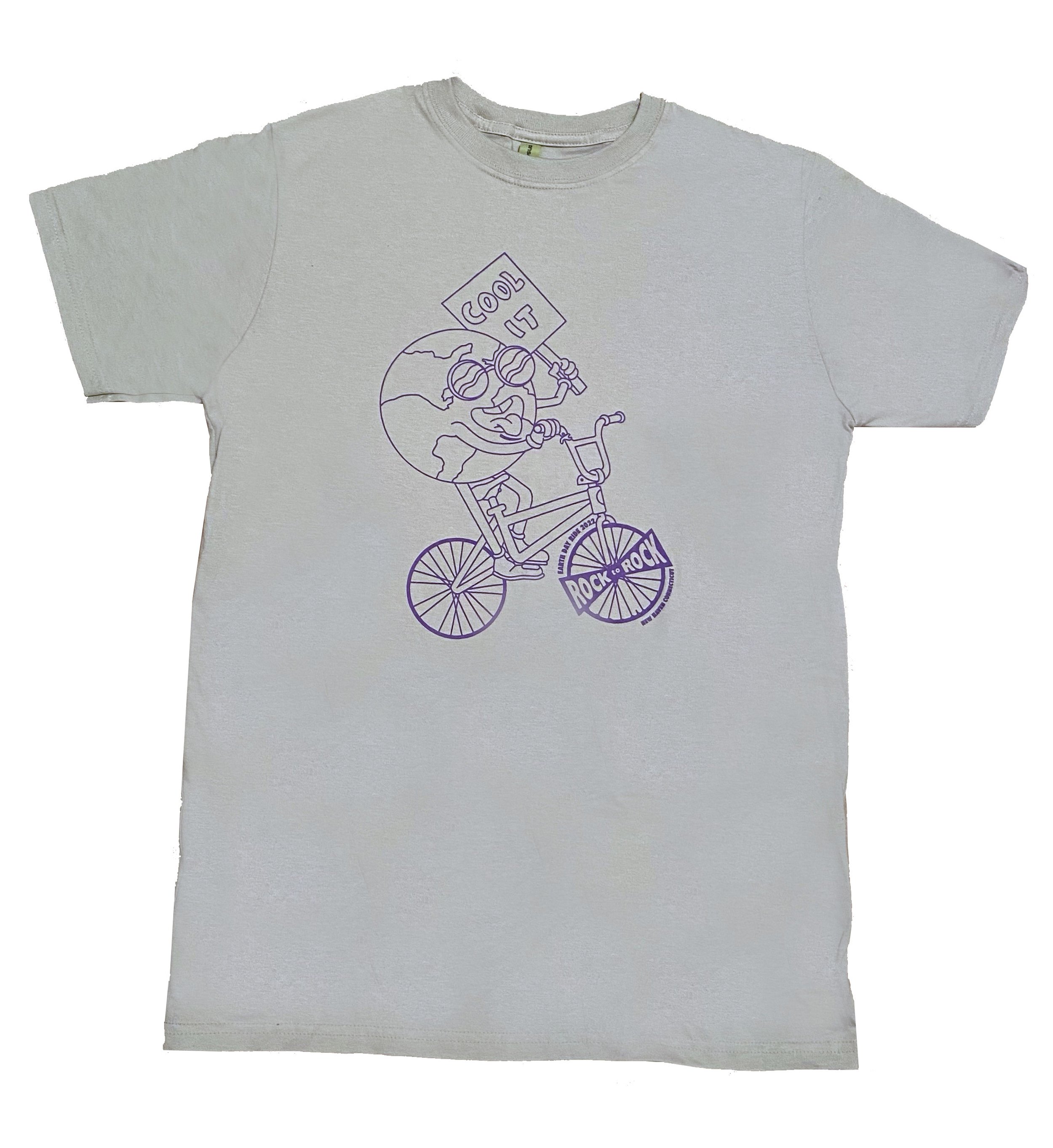
Rock To Rock T-Shirt

Research, Ideation, Creation, and Critiques
To properly represent Rock to Rock I began by researching the organization and its mission. From this, I found that its 13 years of effort have raised more than $2 million to support local environmental work. Since the dimensions of my work were smaller and would be used in a fast-paced bike ride I decided a simplified graphic would be best for this contest entry. I produced multiple sketches testing different mouth shapes, eye directions, and physical attributes to place on a globe. From this, the simple statement of “cool it” clicked due to the important message it conveyed in relation to climate change and the expression of my image. I found the most logical way to embed the Rock to Rocks logo was by implementing it within a bike. Therefore, I researched the most used ones for the race and began to replicate them. I made sure the other wheel matched the logo for a native advertising method. Lastly, I sent my idea to friends interested in environmental efforts and family members. This allowed me to make sure my design was impactful to the target demographic and would be appealing to other pedestrians.
Create A design That Promotes Environmental Sustainability
How can a t-shirt design represent the Rock-to-Rock organization and its annual earth day ride theme of “Clean and Healthy Energy NOW”?To win this contest my design must:
Celebrate the non-profit and environmental work that Rock-to-Rock supports.
Promote and inspire action toward environmental sustainability and climate change
Needs to include the Rock-to-Rock wheel logo design
Cannot exceed 8 ½ by 11 to properly be printed onto the front of t-shirts
Only consist of one color
Designing For (Climate) Change
After being reviewed my graphic was chosen as the winning t-shirt design for the 2022 Rock to Rock Earth Day Ride. As exciting as it was for my work to pay off, what was more valuable was the ability to use my creative skills in acts of service. T-shirt sales contributed to:
Over $165,000 was raised for 20 local environmental organizations.
Representation of the Rock-to-Rock organization and its 575 riders in attendance.
Working with tight deadlines improved my time management skills and work pace.
Led me in applying my design style to other industries
Combining Simple Graphics With A Big Meaning
Inspiration struck from how fun entertainment can be used in teaching valuable lessons. I applied this to my design by grabbing viewers’ attention with a friendly globe graphic. Combined with the deeper message of climate change by integrating the simple text to “cool it”. Placing the globe on a bike not only represented the event of an Earth Day bike ride but also allowed me to implement the Rock-to-Rock wheel logo required for the contest. Using contour drawing techniques let me easily vectorize my work and allowed the organization to change its color to its preference. My youthful design helped represent the range of participants involved in the earth day ride. Therefore, increasing purchase sales and money towards a great cause.


